In what ways does your media product use, develop or challenge forms and conventions of real media products?
.


 Twitter:
We installed a Twitter toolbar into the side of our blog, allowing us to tweet straight from blogger, keeping our followers updated on our progress.
We got a rage of feedback fro twitter, a lot of positive but also some constructive criticism that we were able to work on over the production of our film.
However what I personally found, was that the response we go from twitter tended to be from a younger audience. This was not too much of a problem considering our target audience started 15, however I think that some users may have been a bit younger.
But it was still very helpful, and the fact that it was there on our blog meant we were always tweeting about our progress and our plans, and were able to get feedback on all aspects of our portfolio.

YouTube:

Short films are commonly regarded as some of the most experimental and interesting work within the film industry. Ranging from around 2 to 30 minutes long, they do not often follow the same rules and styles as big, feature length films. Short films have a set of common conventions of there own; and whilst creating my A2 advanced portfolio, I have spent a long time researching these conventions and understanding how to apply them when creating my own short film.
For question one of my evaluation, I plan to look at a number of screen grabs from a range of short films that I have studied, and from my own short film, analysing them on these aspects:
- Narrative Organisation
- Characterisation
- Camera Work
- Mise en Scene
- Genre Conventions
Narrative Organisation:
From my research, I have learnt that short films will often only focus on one main idea or issue in the narrative due to there short running time of only 2 minutes to 30 minutes. I believe that this technique is used as it would be too difficult to fit a complex narrative into such a short amount of time without confusing the spectator and ruining the flow of the film; therefore its kept simple, allowing the plot to be understandable and enjoyable.


Characterisation:
sprocket- big build up to this scary man we dont know what to expect, turns out hes cute old man help iys trcik friends
Characterisation, or character representaion, is an important tool in film making. It allows the film-maker to mould and construct the way in which the audience view each character, whether it be good or bad. Characterisation establsishes the audiences opinions of each character right from the start of the narrative.
This can be used to aid the plot, for example, to create a twist or to build up fear.
A clear exmaple of this is shown in 'Old Man Sprocket', directed by Hazel Meeks.


Camera Work:


Mise En Scene:

Genre:


'After School Then'


- For example one of the short films I have previously researched, 'After School Then', demonstrates a simple, linear narrative. All events throughout the film take place in chronological order, with the narrative starting at the beginning of the plot and finishing at the end, rather than using the style of many other short films by starting in the middle of the story. I think that they have done this as the film is very short, only running 2 minutes and 13 seconds, therefore a very simple plot line is needed otherwise everything would become too complicated.
- My short film 'Transaction' also features a classic linear narrative, and similarly to 'After School Then', it starts at the beginning of the plot and finishes at the end. In addition, my films plot is chronological. We decided to comply with this convention because as previously mentioned, it is a short film and therefore we wanted to have a very simple narrative that we would make as interesting and engaging as possible. As the plot was so simple, it allowed us to make it more exciting through the use of more interesting and varied camera angles, effects such as the email scene and the use of a GoPro.
- At the beginning of 'After school then', we are thrown straight in to the action. Although it is the start of the narrative and the story, we do not know anything about the characters, why the fight is occurring, or what the outcome will be. I have found this to be quite a common technique within short films, as it tends to make the plot more engaging and exciting, causing the spectator to question what is going on.
- We felt that for our film, this would be a really good technique to follow. It is an important feature to our film, that the audience do not know who the two characters are, or what their relationship is. It is this unknown that makes our film so engaging and the twist so enjoyable. It is especially important that the audience don't know what the motorcyclist looks like, as it creates an eerie feeling about his character, which makes the twist more humorous, as the audience find out that he is not scary at all. Furthermore as our film is so short we were limited as to what content we could put into our film, and background stories of the characters were not really important.
- In terms of narrative theory, I feel that Todorov's theory could be applied to 'After School Then', for example: Equilibrium- the boys walking out of school talking. Disruption- talking about the fight, knowing it going to happen. Confrontation- the fight is about to take place, however then the twist occurs and the girl beats him up. New equilibrium- when we find out the sister won the fight.
- I also think that Todorov's narrative theory can be applied to my own film 'Transaction'. Equilibrium- as the character is emailing, everything seems normal. Disruption- immediately disrupted as the audience sees what the email is about and as the journey begins (the music adds to this to create a tense atmosphere). Confrontation- The two characters meet for the swapping of the package, the audience still doesn't understand whats going on. New equilibrium- as the motorcyclist arrives at house and the twist is revealed.
- Vladimir Propp's narrative theory of the character roles could also be applied to my own work. I think that the audience would view both the characters as 'the villans' throughout the narrative, until the twist at the end, when it becomes apparent that the motorcyclist is getting a present for his sister, and therefore becomes 'the hero'. I would say that the other character then becomes known as 'the helper', as he aided the hero on his journey by giving him the package.
Characterisation:
sprocket- big build up to this scary man we dont know what to expect, turns out hes cute old man help iys trcik friends
Characterisation, or character representaion, is an important tool in film making. It allows the film-maker to mould and construct the way in which the audience view each character, whether it be good or bad. Characterisation establsishes the audiences opinions of each character right from the start of the narrative.
This can be used to aid the plot, for example, to create a twist or to build up fear.
A clear exmaple of this is shown in 'Old Man Sprocket', directed by Hazel Meeks.

- From the very beginning of the narrative, a strong image of Sprocket himself is portrayed. The image is first created as the three young characters tell stories of all the horrible things that Sprocket does, such cutting people up with an old, rusty knife. Through this short dialogue the audience are already encouraged to see sprocket as evil and dangerous. This begins to create a tense atmosphere which is supported by the eerie music and low key lighting. Furthermore the boy who enters the 'world of old man sprocket', looks terrified and vulnerable This encourages the audience to empathise with the boy and want to look after him, this is once again making Sprocket seem more and more evil. This whole representation of Sprocket is created before the audience have even seen him, showing how effective characterisation is. When the audience are finally introduced to the character of 'Sprocket', they learn that the big build up of a scary old man that was going to attack the young boy, was all wrong, and in fact he is shown to be fairly nice, as he helps the boy trick his friends. This twist may cause an anti-climax, however it shows the effects of building up a character image, without having to even see the character.

- This relates to my own film, 'Transaction'. Our masked, motorcyclist character, 'Mr X', has a hidden identity until the very end of the narrative. Therefore, we had to use other aspects t our film to create his character representation, and make the audience perceive him in a way that would be most effective for our film. His costume is all black, and he wears a helmet throughout most of the film. The eye mask of the helmet is also blacked out, therefore none of his appearance is revealed. We also know nothing about his identity: who he is or what is collecting. The dark costume has connotations of danger and criminal activity, and his motorbike adds to his dangerous composure. Throughout the journey to the transaction, and the transaction itself, the audience are encouraged to believe that 'Mr X' is a criminal, and that the package is most likely drugs or some other criminal object. This dark representation is kept up until the final twenty seconds of my film. 'Mr X' then takes of his helmet and reveals his identity. I feel that this will shock yet also humour the audience, as the image that had been built up of Mr X was completely misleading, and he is actually just a normal guy getting a present for his sister.

Camera Work:
- Short films often use a number of different camera techniques creating an interesting variety of shots. It is a common convention for short films to show examples of new camera techniques being tried out, as they are typically low-budget experimental pieces of work.
- We attempted to do this and be experimental, by using a 'GoPro'. The camera shots that we gained using this tool were really creative, and made our film more interesting to watch, but also more individual as short films are. Our audience feedback told me that our GoPro shots were really successful, they made our shot sequences much more varied and added to the tense atmosphere of our plot.
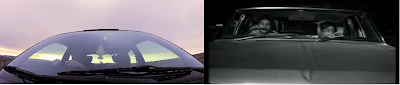
- One film that I took great inspiration from in terms of camera techniques was 'Two cars one night'. As you can see form the screen grabs below, our two shots are very similar. They are both mid-close up shots of the cars, whilst also showing some character as well. However you can see that there is a slight experimental twist on the shot from our film, as it is taken using the GoPro.

screen grabs from my own film, 'Transaction', and the short film, 'Two Cars One Night'.
- As our film has a twist at the end, and the audience are not given much information about the characters or the meeting, we had to ensure that our camera did not reveal too much about our restricted narrative, yet it was still exciting and engagingly I do feel that the motorbike and the car played a big part in our camera techniques being so thrilling, and I would say that the use of this technique is our unique selling point.


- We used a lot of close up's of 'Mr X', to create suspense around his character, and used a number of long shots of 'Mr Y', to create a feeling of being alone as he stood in the rural, bare location.
Mise En Scene:
- Mise en scene is a vital part of any film as it literally means everything within the frame. In our film, we used it to create suspense surrounding our characters and our plot development.
- Costume was key for my film, as discussed in my characterisation post, as it was the costume that made 'Mr X' appear scary and dark. 'Mr Y's' costume was rather basic, as his character did not need any emotive attachments to it.

Genre:
Short films are often examples of cross-genre, as they may conform to a number of different genre categories, or show slight hints of lots of different genres. They can also become examples of sub-genres, where two genres become merged into one. However something that is also very common for short films, is to resist being placed into any genre category at all. This is often because they are so experimental and alternative.
I feel that my film is an example of cross-genre, as it is a thriller, until the twist is revealed and then the audience become aware that it was only a birthday present and therefore is not thrilling at all. The ending could be classed as a comedy, and it is an anti-climax, not the ending the audience would be expecting.
One film that I took inspiration from, was 'Black hole'. The film is quite eerie throughout, when he discovers the black hole it is tense, keeping the audience waiting for something possibly scary of dramatic to happen, however the ending is a slight twist, and is also comical as he locks himself in the safe.
I think that Steve Neale's theory of repetition and difference could be applied to my film, 'Transaction'. The repetition, would be the conventions of a thriller that we portray throughout our film, for example the tense non-diegetic sound track and the masked character who is not revealed to the audience until the end of the narrative. However, the difference would be the ending. It is not the typical ending that you would expect of a thriller, as it is slightly comical and eerie like the rest of the film. This is why I would say that our film could also be classed as a comedy.
Film Poster:
Film posters are used in order to create an attraction for the intended audience of the specific film. They are an important and useful tool for advertising and creating awareness/interest about the new release. Film posters are designed to be eye-catching and engaging, in order to get them noticed by people, drawing in an audience and creating a hype.
Through my research I have found that film posters, both feature length and short have a number of common conventions, that appear on nearly all the posters i have looked at. These conventions are-
- Film Title (this should be the largest text on the page, and usually takes up one third of the poster.)
- Key Image (often showing the main characters, especially if the actors are particularly well-known. often shows some setting)
- Billing Block
- Critical Acclaim
- Cast Names (depending on how well known they are, bigger stars will be written in bigger fonts)
- Tagline
- Film Website
- Film Festival Logos
- Sponsors
Here are some examples of film posters:

Here is my own poster design:

I attempted to conform to all of the conventions previously mentioned, in the hope of creating a poster that would professional as possible.
Title-
Throughout my research into posters, I found out that it was vital for the titling to be the largest text featured on the poster, in order to draw in attention. When creating my own poster, I made sure to follow this convention by making the title very large on the page. I also designed the title in a vibrant, eye-catching red colour, that was sampled from the featured characters gloves. This made the title bold on the page, catching your attention. This is exactly what I wanted for my poster, and I feel it is important that the title catches the audiences attention and sticks in their head.

Actors Names-
In big budget feature length films, the actors names are sprawled across the page in a large font. This is because the actors are well known, and therefore will draw in an audience of their own. However, as my company is low-budget and independent we could not afford to hire famous actors. This mean that it was not necessary for the actors names to be really large on the poster, as they wouldn't attract an audience themselves as they are not yet well known.

Billing Block-
The billing block, also known as a credit block, is a legal section of the poster that must always be featured. It is usually at the bottom of the page in a very small font. Often the billing block is not even noticeable and it is never really read. The billing block is there in order to credit the right people involved in the making of the film. Below is an example of my billing block that I created in Photoshop to be placed on to my own poster.

Key Image-
Nearly every poster I have studied featured a large, key image of at least one of the main characters featured in the film. Sometimes the image also included some key setting/location. For example, the 'This is England' poster shows all the key characters lined up against a iron wall, with an housing estate in the background. This image not only reveals the characters but also some location, which then suggests to the audience the characters social class. However some posters resist this, and feature an image of the character(s), but edited onto a plain or animated background. Juno for example shows the two main characters however they have been planted onto a bright background that reveals nothing about location. This is probably because the setting is not key of the film or does not influence the characters as much as other films do. For my own poster, there is no location revealed as it is a really close-up shot of the main character.

Critical Acclaims-
There are some critical acclaims featured on all the posters I have looked at. It is a chance for someone who would encourage your particular audience to go and see the film, give their opinion Usually the quote is really positive and you obviously want it to look as good as possible. It is important who to consider getting the quote from as it must translate to your target audience For my poster, I quoted Little White Lies', as this not only linked in with our review and targeted the niche audience we aimed for, but the LWL audience demographic overlapped with our target audience, therefore making it the perfect critic to quote.

Film Festival Logos-
Film festivals are a great way to promote short films, and in a real context I would plan to promoted mine at a number of ones. Therefore I thought it was an important tool to promote these festivals on my own poster as they are an important tool for getting films our there and commercialising my product.
The Review:
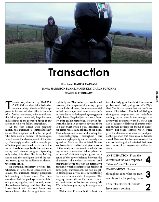
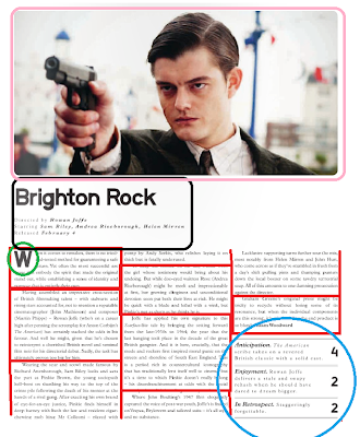
Our second ancillary task, the review, was created in the style of 'Little White Lies' magazine. I had researched the conventions of the reviews published by Little White Lies, so that I could conform to these rules and therefore make my review very realistic. I followed the exact layout rules of a real LWL review, making all pictures and text boxes the exact same dimensions as the offical layout. Little White Lies follow the same layout pattern in every issues, only adapting the image and the text to suit that particular issue. You can read more about this in my previous blog post, click here.
 |
| This is my LWL review. |
 |
| Real LWL review. |
Conventions of review:
- Little White Lies reviews are roughly 550 words long and have around 6 paragraphs, as shown by the red boxes. When creating our review we made sure to follow these conventions, with our review also having 6 paragraphs.
- The blue circle indicates where the Little White Lies point system is located on the review. 'Anticipation', 'Enjoyment' and 'In Retrospect' are all scored out of 5 for the concerning film in the review. Again we followed this when creating our own review and scored it 4,3 and 2.
- The smaller green circle is highlighting a convention of the Little White Lies review, a large statement letter. Once more, we copied this for our review. The large letter is the first letter of the text, and is roughly 3 lines large.
- The black box is showing where the film title, director name, actors names and release date are located on the review. This ranges from being centered to being to the left like bellow. We had ours centered as we believed this looked neater and more professional.
- The larger pink is indicating where the large high quality screen-grab is situated. This image is always taken from the film, not a still image, as i learnt from my research. Again, we followed this convention when creating our review and took a large high quality image from a key moment in our short film.

Question Two:
How effective is the combination of your main product and your ancillary tasks?
Question Three:
What have you learnt from your audience feedback?
Whilst making my advanced portfolio, I have used audience feedback to help me make important decisions about my work. I think that audience feedback is incredibly important, because overall if no one wants to watch your film it is not going anywhere, and by asking the audience what they think gave me a chance you really improve my work. I got feedback on all aspects of my portfolio, the film, the review and the poster, getting comments on all parts of my work.
I ensured that my research was gathered from a good variety of people; all ages and both genders, but especially looking at my target audience.
i gathered my feedback a number of different ways, such as Facebook, Twitter, YouTube and teachers.
I found social networking sites to be the most easy way to gain feedback, as my target audience is 15-30, and that is a very common age of Facebook users! Plus all my friends are on Facebook and it is an easy way to get them to watch my film.

Facebook:
 Here is my post that I created on Facebook; I was asking for feedback and comments on my short film. By using Facebook to show my video, it meant all my friends that were online at the time could simply click and watch, only taking a few minutes. It was also really useful as I got a real range of people giving me comments, all different ages and genders. However I took close care in reading what my particular target audience had to say about my film.
 Initially, I only got feedback through the use of Facebook's like button. This shows people have liked it but means I cant find out why they liked it. I think this is because I simply posted the video without asking for comments. So I then deleted the post, and created a new one with a list of things that people could comment on. You can see this list in the image above.

How effective is the combination of your main product and your ancillary tasks?
Question Three:
What have you learnt from your audience feedback?
Whilst making my advanced portfolio, I have used audience feedback to help me make important decisions about my work. I think that audience feedback is incredibly important, because overall if no one wants to watch your film it is not going anywhere, and by asking the audience what they think gave me a chance you really improve my work. I got feedback on all aspects of my portfolio, the film, the review and the poster, getting comments on all parts of my work.
I ensured that my research was gathered from a good variety of people; all ages and both genders, but especially looking at my target audience.
i gathered my feedback a number of different ways, such as Facebook, Twitter, YouTube and teachers.
I found social networking sites to be the most easy way to gain feedback, as my target audience is 15-30, and that is a very common age of Facebook users! Plus all my friends are on Facebook and it is an easy way to get them to watch my film.

Facebook:

 Initially, I only got feedback through the use of Facebook's like button. This shows people have liked it but means I cant find out why they liked it. I think this is because I simply posted the video without asking for comments. So I then deleted the post, and created a new one with a list of things that people could comment on. You can see this list in the image above.
.
Below are some screen shots of my audience feedback gathered via Facebook.


- The audience feedback was overall really positive. There were some really nice comments about our techniques using the 'GoPro', which as we predicted, made the audience find the film more exciting and thrilling. This was all really nice to hear, however there were also some comments that suggested to me that we should review our footage and see if we needed to make any changes.
- For example one comment said that some shots were 'quite long and dragged on'. As a result of this, we looked over our footage and added in some more shots that we had previously filmed, in attempt to break up the footage and make it more pleasing to watch. Although we could not re-film the scene and therefore improve it completely I do feel that due to the comment we were alerted to a problem and were able to make our film better!
 Twitter:
We installed a Twitter toolbar into the side of our blog, allowing us to tweet straight from blogger, keeping our followers updated on our progress.
We got a rage of feedback fro twitter, a lot of positive but also some constructive criticism that we were able to work on over the production of our film.
However what I personally found, was that the response we go from twitter tended to be from a younger audience. This was not too much of a problem considering our target audience started 15, however I think that some users may have been a bit younger.
But it was still very helpful, and the fact that it was there on our blog meant we were always tweeting about our progress and our plans, and were able to get feedback on all aspects of our portfolio.

Here is a screen grab of some audience feedback I received on twitter about my poster design!
YouTube:
- We uploaded our film onto 'Youtube', one of the biggest music/video sites available. 'Youtube' is an open website, and therefore our film can be viewed by anyone. We felt that it was the right place to show our film not only because is so popular, but because the average 'Youtube' user is aged 27, which is perfectly in our target audience!
- Some really good features of 'Youtube' are the view count and the like tool. As you can see in the screen shot below, we have had an impressive 144 views and a few likes. The comments have all been really positive on 'Youtube' so far, so I haven't really learnt anything from that particular feedback.

Question Four:
How did you use media technologies in the construction and research, planning and evaluation stages?
How did you use media technologies in the construction and research, planning and evaluation stages?