Qu 1) In what ways does your media product use, develop, or challenge forms and conventions of real media products?
Short Film Format
Short films are renowned for their particular story lines that immediately grab the attention of the audience. They are often idiosyncratic story lines because they help to stand out during the very short time they are shown. As the time span is so short – 2 to 30 minutes – it is vital to have a simple yet effective plot. This is important as this avoids confusing the spectator with a complicated pot which cannot be unravelled within the limited amount of time. We also discovered that many are not under one specific genre such as: Comedy, Romance, Horror, Thriller but cross a multitude of genres. This is due to such a short amount of time it’s hard to narrow the film down into one genre.
Narrative
Characterisation
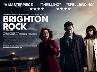
In 1964, Pinkie Brown, a sociopathic member of a Brighton gang, murders a man who has himself killed the gang leader, Kite. He befriends Rose, a young waitress who had witnessed gang activity, so as to keep an eye on her, and she falls in love with him. In order to prevent her from being made to give evidence against him, he marries her. Ida, Rose's employer and a friend of the man killed by Pinkie, takes it upon herself to save the girl from the monster she has married.
Genre: The use of the backgrounds colour could be suggesting an eventful storyline so it is most likely an action thriller. This is reinforced by the facial expression of the male and female on the right, along with the male’s body language which is suggests that he is aggressive and possibly violent. The costume used helps the audience suggest the genre and era of the film, for example the clothes worn are 'very sixties' and the film is probably from that era, also the male character has his collar up on his coat which may suggest crime in the narrative, it's as if he has something to hide about his identity. The large and bold white title displayed on a dark background also suggests that this film could be a thriller including the narrative use of binary opposites shown through the use of lighting for example the poster uses low key lighting vs whereas the film narrative may use good vs bad. It is directed at an older audience this is shown by the genre portrayed, the age certificate of 15.
Representation: The male character seems to be a representation of a young middle class adult (suggested through his clothing). His facial expression seems to suggest an aggressive possibly violent disposition portraying a generalization that young males could be holding in anger and rage which could threaten or harm others. The woman on the right seems to be mirroring the male characters basic aura whereas the woman on the left seems to be much more concerned about the male, suggesting she could be looking out for his safety and well-being giving the impression that she is a much more emotionally compatible character to the audience. This could be a generalization of what people were expected to be like during the time this film was set, the film is based pre-world war 2 so it could be a representation of the animosity that lead up to the events that would take place. The femininity and masculinity on the poster is very clear with the positioning of the characters, the composition of the frame, and the costume, body language and facial expressions of the characters. We’re told that the male character is empowered, the older female character is traditionally represented in a pink coat with a vulnerable expression, and the younger female is a more modern representation, looking in control and fashionable.
Target Audience : I would say the target audience would range from 15 and over. With Helen Mirren and John Hurt starring in it, I would think the film would open up a much bigger target audience to the older generation. This is due to both stars performing in other films and being respected actors of the film industry with their own fan base. We can also assume that the readers of the classic novel would be interested to see the adaptation as there is already a fan base for the product with a more mature audience.
Short Film Format
Short films are renowned for their particular story lines that immediately grab the attention of the audience. They are often idiosyncratic story lines because they help to stand out during the very short time they are shown. As the time span is so short – 2 to 30 minutes – it is vital to have a simple yet effective plot. This is important as this avoids confusing the spectator with a complicated pot which cannot be unravelled within the limited amount of time. We also discovered that many are not under one specific genre such as: Comedy, Romance, Horror, Thriller but cross a multitude of genres. This is due to such a short amount of time it’s hard to narrow the film down into one genre.
For inspiration I watched and analysed 4 short
films and in this 9 frame sequence I chose my favourite 3.
- Row 1 is called Skirt and is found here on Vimeo.
- Row 2 is called Dream Girl and is foundhere on Virgin Media Shorts.
- Row 3 is called Mud Boy and is found here on BBC Film Network.
Narrative
- Skirt has a linear narrative structure with closure like our film Transaction. Not all short films adopt this narrative organisation but many do which is often due to the timing of the film being limited. If a film were to have a complex narrative structure, but was only 5 minutes long, this could be very confusing for the audience and they may not understand the plot.
 |
| CHARACTERS IDENTITY ARE HIDDEN |
- Characters are constructed media representations of reality. In Skirt neither of the characters are presented as particularly stereotypical. This implies that Amanda Boyle, the director, wanted to represent modern ideologies around femininity and masculinity. Frame 1 shows us the man in a white T-shirt and the young woman in a colourful quirky outfit.
- Throughout the film she isn't afraid of her individuality and she is wearing little make-up which again represents a modern reality as she does not feel the need to make an exceptional effort in order to present herself to males as particularly feminine.
- The limited use of dialogue not only emphasizes the fact that this is a short film, but it also tells us a little about their character. Shyness is clearly something which they both have in common which leads to the two characters showing odd gestures of affection towards one another.
- Skirt has little in common with Transaction in terms of characterisation but both of the films involve only a few characters which again reinforces the fact that the two are under the genre of short films.
- Camerawork is simple yet effective with an array of clever shots that feature both characters in view.
- Different angles as they play tricks on each shows dominance through their actions and repeatedly roles are reversed.
- We have tried to implement this sort of idea into Transaction, where the 2 characters are both always in shot together when they finally meet. This allows the audience to understand what is happening.
Mise en Scene
 |
| ISOLATED LOCATION ON DOWNS |
- The lighting is fairly neutral with limited colours. This gives the idea of living with basics and cheaply.
- The setting is also different as they are sharing a flat, which is apparent in frame 2 - a cheap looking flat. This is realistic socially as both of the main characters look young.
- Our films differ here a lot. Skirt is kept in one location - the flat, whereas Transaction the location changes from a room with a computer, 2 vehicle journeys, a meet at an isolated location and back to the Birthday Girl's house.
Use of Genre Conventions
- Skirt shows elements of Romance as it revolves around the two characters who make flirtatious and odd gestures of affection towards each other. Referring to Rick Atlman this is known as a 'syntactic code'. In frame 3 we can see that this man has put the young woman's clothes and possessions in a neat pile for her.
- The Genre is hard to tell as its so short - 02:40 minutes long but it leans towards Romance over anything.
- This again is similar to our film as a genre is difficult to establish being only 5 minutes long. Research of watching short films proved this. As short films are not long at all it's hard to apply something so solid to a film with a simple plot.
Editing
- Skirt has been edited into a montage of different shots for different days to represent the change in time without making the film too long.
- Simple cuts have been used which is different to our film as we have often used fade transitions in order to represent the change in time but only of hours and minutes not days.
- Another difference is the use of non-diegetic music. We decided to use non-diegetic music in order for the story to become fast paced and full of suspense but Skirt, however, used only diegetic sound which I think is more effective for this film as it emphasises the awkwardness between the two characters which is an important aspect in the film.
Ancillary Tasks
Film posters are used to try and attract the target audience
of the film that is being distributed. They are very important to gain public
interest to the product, even in this technological day, and are used
everywhere from tube/train stations to the back's of buses. They have to catch
the eye of people very quickly, and attract them into seeing the film. The
visual elements on a movie poster can convey powerful messages. The best
posters make people anticipate an upcoming release.
- It
has to get your attention and jump out at you.
- It
needs to be iconic - but without giving away too much.
- It
needs to make the film look interesting and make you want to watch it.
- It
needs to have appeal to everyone so you can expand your target audience.
- The
style of the poster needs to keep with the film otherwise the audience may
not get what they expected.
- It needs to have a classic look that won't age and continue to look good.
Important components to include in a Film Poster:
In a film poster there needs to most importantly, be an image or more to give the audience an idea of what the plot is about. It can be hand drawn or taken photographically. The title of the film needs to be clear. Also it's important for the A list celebrities to be named in a big font to attract their fans, it's equally important to name the main cast including the Director and Production team. There needs to be a few reviews from the media to show its credibility. It needs to clearly show the date it's coming out. There is also normally a tag-line or phrase from the film to try and catch peoples attention and make them curious to see the film. A film certificate is also vital to show what the certified target audience has to be above. Finally the production company is on the front to show the audience who it has been made with.
Brighton Rock (2010, Directed by Rowan Joffe)

Genre: The use of the backgrounds colour could be suggesting an eventful storyline so it is most likely an action thriller. This is reinforced by the facial expression of the male and female on the right, along with the male’s body language which is suggests that he is aggressive and possibly violent. The costume used helps the audience suggest the genre and era of the film, for example the clothes worn are 'very sixties' and the film is probably from that era, also the male character has his collar up on his coat which may suggest crime in the narrative, it's as if he has something to hide about his identity. The large and bold white title displayed on a dark background also suggests that this film could be a thriller including the narrative use of binary opposites shown through the use of lighting for example the poster uses low key lighting vs whereas the film narrative may use good vs bad. It is directed at an older audience this is shown by the genre portrayed, the age certificate of 15.
My Final Poster
- The use of the Red Title and matching logo on his gloves stands out very clearly and suggests danger.
- The image Isaac took of James is very effective as James/Mr X is completely un-identifiable. The fact James is in his Motorbike Leathers and Helmet - very little about the film is given away creating the ambiguity we wanted to achieve.
- The Low Angle makes James looks very domineering and quite threatening.
- The Black and White image further makes it look mysterious.
- The picture of James putting the package in his jacket will make the audience curious as to what the transaction is about.
- The only thing that is missing is an Age Certificate - It would probably be a 12.
Film Reviews
A film review should have a number of purposes:
- To describe. The review should describe the story, characters and some of the action - without spoiling the plot or giving too much away!
- To inform. The review needs to tell people who is in the film, who it is by and where or when readers can see it.
- To analyse. A good review gives an opinion on whether the film is good or not and why.
- To advise. Finally, the review should tell the reader whether or not to go and see the film.
 |
| LWL REVIEW |
The magazine reviews is what introduces an in-depth written piece about our work. The template is the same for each one. The format is very clear and bold, making it eye catching. The magazine uses a tripartite ranking system. The categories (Anticipation, Enjoyment and In Retrospect) are marked out of 5 and accompanied by explanatory text.
Conventions of a good Film Poster
- Express your opinion of the film, but support your criticism.
- Adjust the style of your review for the readership.
- Avoid spoilers.
- Judge the story.
- Rate the actors.
- Evaluate the technical elements.
Qu2) How effective is the combination of your main product and ancillary texts?
Video answer.
(Sorry for um-ming so much and looking around a lot, I get a bit awkward on camera! I even had my script on my lap would you believe!)
3) What have you
learnt from your audience feedback?
Audience
feedback is very important for our group as it helps us to understand what we
could have done better and how we could have improved. It is important to be
able to take critique on our work because it furthers how we can advance and
amend our work. Also Audience Feedback helps to point out what really worked
and looked good, and gives us a sense of pride in our work. I personally used Facebook and Windows Live email to gather my feedback.
 From Feedback from
Hannah 17, it was noted
that the wind was noisy in some parts. Although we tried hard to soften it, in
hindsight we should have put the wind muffler on the microphone to quieten the
noise because there was only so much editing we could do to minimise it.
However on a positive she really enjoyed the opening shots of
Feedback from
Jack 18, shows an
impressed attitude towards our editing complimenting on the great continuity
and colour grading. This is good to get feedback on our editing as editing
plays a vital role in making the film come to life and give it a smooth feel.
As a group we take pride in our editing and tried to incorporate many different
shots and angles with many techniques such as match on action, 180 degree rule
and over the shoulder shots just to make it flow that bit better and to make it
look as professional as possible. Since last year our editing has improved
vastly and we worked much faster towards finishing our film. I personally now
feel more confident editing and adding music in alone whereas last year I felt
a bit intimidated from all the Mac shortcuts. A note Jack said we could improve
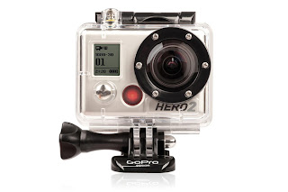
on, was that as the bike pulled out of the Ditchling Beacon Car Park, the GoPro
microphone picked up a lot of noise from the motorbike as the camera was
sitting at the back. This unfortunately is a lot noisier than the next shot of
the motorbike and Jack suggested we could of brought the noise down and brought
the atmospheric music up. Evaluating his comment I agree, it would have further
pushed the continuity and would have pushed the suspense further instead of
halting it.
This leads on to
my feedback from Isaac 19.
He suggested that after the Transaction on top of the Downs ,
it felt a little lack lustre and that some of the atmosphere was lost as we
longer made the film about the build up. We made it more of a build down in
towards a nice ending. We should have pushed the ending more, aiming to carry
on increasing the tension and suspense right towards James knocking at the
door. But as we lost the action paced music so was the atmosphere. To amend
this we should have added in more fast paced music, and brought in more shots,
perhaps of James looking very nervous or worried before he handed the package
to the Sister. However he noted that the action fueled music at the start
immediately helped set the atmosphere and again grabbed his attention which was
one of our aims. In addition he complimented good camera shots throughout which
was nice to hear as we had tried to be more adventurous than last year and add
a wider variety in.
I also
personally feel like I have improved vastly with filming since last year with the
foundation portfolio, as I featured in it more last year so didn’t get as much
of a chance to experiment with the camera. Yet this year as I wasn’t really in
it, I got the opportunity to use the camera a lot more and really work on my filming
and improve my skills with the camera. Lastly Isaac commented on the fact that
tension was maintained throughout. This was one of our biggest aims with the
plot, so to know it succeeded was good to know.
 |
However Kirsty
believed we could have created more urgency within the Transaction to further
to develop the tension. Yet we did try our best to create this sense of urgency
with fast paced cuts and energetic music but to further it we could have added
in shots of the Birthday girl maybe at home looking sad and alone with birthday
banners and cards around her establishing that she is waiting for someone to be
with her on her birthday. This wouldn’t give too much away to the audience but
could push the tension additionally.
Concerning the
poster I feel that we should have had more of a group input towards the final
poster and what went on it since the font doesn’t quite fit the feel of the
piece and the tagline feels unnecessary. Some feedback showed that my initial
design was more popular but by then the final one had already been uploaded. However the picture
used in the Final Poster works well, and is of sharp quality. The restricted
view of the picture creates ambiguity which we wanted, and makes the audience
want to know more. The Title stands out and grabs attention, and with the black
border at the bottom makes it clear where the Credits belong and doesn’t deter
from the feel of the poster.
The review as
part of the Ancillary Task, I particularly am pleased with. As we had to mimic
the layout of Little White Lies and write about our own film in the style of
their writing I think it is very unbiased and well put together. Harrison and I
tried to write it well and focused on how we said things whilst expanding our
vocabulary to make it sound intelligent yet witty like the style of Little
White Lies. We felt we complimented and critiqued where necessary and with
notes from our Teacher we worked hard to amend it to make it the highest
standard possible. Comments from Jeremy 42 ‘Very well written, and it gives
away enough about the plot to make the audience want to view it,’ gave evidence
that the review did what we wanted it to – make the audience want to view our
film. Looking back at that I think we worked hard on that and am pleased with
how it turned out.
Qu4) How did you use new media technologies in the construction, and research, planning and evaluation?
Prezi Answer.


OK - but how can I comment on your draft in that case? You missed the draft deadline!
ReplyDeleteI'm puzzled that you have still not posted anything here for me to look at. As I said, you wouldn't have got the full amount of time as your work is so late, but surely some advice would have been useful? I'm more than a little worried by this.
ReplyDelete