Wednesday, 30 January 2013

Garage Band Sound Editing - Typing (Harrison + Isaac)

Today Isaac and I have exported the movie to garageband to edit in some foley sounds. In this post we are showing how we cut up a clip we got from garageband to make it look like our title clip that reads "Transaction." has an individual clip for each letter to make it look like it is being typed.

To do this we had to take one clip and cut each click and time it correctly to make it look like it was being typed.

Here is the screenshot of what we did and as you can see a lot of clicks and specific placing was involved.


We are now going to carry on with the movie and try to complete the final piece.

Tuesday, 29 January 2013

Idea for Email scene.

This was an idea I had that could be used for the email scene. Scrapped it though because it wouldn't have fit in with the film.

Blog Layout

As I was unwell today and couldn't make it to college to edit the final production I decided that the blog needed a bit of an overhaul as it wasn't very attractive, I wanted to make it simple and pleasing.

For starters, here is what it looked like at first:


Very bland and boring! Also the margins of the columns was off meaning that the pictures were going over the borders into the other columns making it look messy, I decided to clean that up, change the colour scheme, add a personalised header and make the Twitter feed work.

It now looks like this:


Which in my opinion looks a lot nicer and as it is personalised to us suits it a lot more. Also the Twitter feed is now working and there is a blog archive making it easier to navigate our work.

I made the header in Photoshop and found the 3 logos (Facebook, Twitter and YouTube) online which were very handy and make it look a lot nicer.


The one problem I faced was trying to add links to the header, there is not a specific part on blogger where you can do so, so I visited a website called image mapper which enabled me to map the image and generate an HTML code which I then pasted into a new widget on Blogger which then produced the image as a header with the hyper links over the places I selected but it was off centre and raised a bit which didn't look right, I was able to centre it but I wasn't able to lower it so I have just resulted in using the first one with out the links for the time being and adding a new page with all our links.


Photoshop Idea for a Film Poster - Carla


Today I tried to get to grips with photshop. I found it quite tricky to use and spent a lot of time just making this simple film poster idea of the South Downs. I don't think it is that great, but it was good for me to play around with Photoshop and roughly know how to use it.

Monday, 28 January 2013

Analysing 2 Film Posters - Carla


As our story-line is meant to be an over exaggerated anti-climax, we want the film poster to look really ambiguous and make the audience wonder what they are going to watch.

Primer (2004, Directed by Shane Carruth)

Primer science fiction drama film about the accidental discovery of a means of time travel.   Four friends/fledgling entrepreneurs, knowing that there's something bigger and more innovative than the different error-checking devices they've built, wrestle over their new invention.   

Narrative -This poster manages to tell the viewer very little whilst still enticing the audience in. The use of restricted narration from the poster creates ambiguity and makes the audience curious to find out what its about. The dark lighting gives the idea there is a dark twist in the plot.

Genre - The use of the Title made out of cables gives the idea it is a Sci-Fi film. The focus attention is towards a piece of isolated machinery. This gives the idea it is a film with elements of heightened drama and futuristic technology. The dark lighting with a bright light on the machinery gives it an eerie effect. We know the movie is based on the piece of machinery because the light is shining straight on to it and there is nothing else it the picture apart from cables and the caption 'what if it actually works?' 

Target Audience -

Representation - 


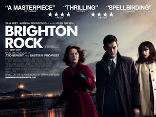
Brighton Rock (2010, Directed by Rowan Joffe)

In 1964, Pinkie Brown, a sociopathic member of a Brighton gang, murders a man who has himself killed the gang leader, Kite. He befriends Rose, a young waitress who had witnessed gang activity, so as to keep an eye on her, and she falls in love with him. In order to prevent her from being made to give evidence against him, he marries her. Ida, Rose's employer and a friend of the man killed by Pinkie, takes it upon herself to save the girl from the monster she has married.

Narrative - From looking at the male characters face it gives the idea it is an action/thriller themed film, along with the use of clouds and sky, the darkness and the light this reinforces the idea that this is a good vs. evil / revenge and redemption styled movie circling around the male character. The poster portrays the main protagonist very obviously with a traditional representation of masculinity, this is shown through the centre positioning of his character and his name being put first in the text of actors names characters connoting that he is of higher importance and is at the centre of the narrative. Also the low key lighting used on one side of his faces portrays him as evil or showing the emotion of anger this is also shown through his facial expression and body language as his is posed 'ready for action'.

Genre: The use of the backgrounds colour could be suggesting an eventful storyline so it is most likely an action thriller. This is reinforced by the facial expression of the male and female on the right, along with the male’s body language which is suggests that he is aggressive and possibly violent. The costume used helps the audience suggest the genre and era of the film, for example the clothes worn are 'very sixties' and the film is probably from that era, also the male character has his collar up on his coat which may suggest crime in the narrative, it's as if he has something to hide about his identity. The large and bold white title displayed on a dark background also suggests that this film could be a thriller including the narrative use of binary opposites shown through the use of lighting for example the poster uses low key lighting vs whereas the film narrative may use good vs bad. It is directed at an older audience this is shown by the genre portrayed, the age certificate of 15.

Representation: The male character seems to be a representation of a young middle class adult (suggested through his clothing). His facial expression seems to suggest an aggressive possibly violent disposition portraying a generalization that young males could be holding in anger and rage which could threaten or harm others. The woman on the right seems to be mirroring the male characters basic aura whereas the woman on the left seems to be much more concerned about the male, suggesting she could be looking out for his safety and well-being giving the impression that she is a much more emotionally compatible character to the audience. This could be a generalization of what people were expected to be like during the time this film was set, the film is based pre-world war 2 so it could be a representation of the animosity that lead up to the events that would take place. The femininity and masculinity on the poster is very clear with the positioning of the characters, the composition of the frame, and the costume, body language and facial expressions of the characters. We’re told that the male character is empowered, the older female character is traditionally represented in a pink coat with a vulnerable expression, and the younger female is a more modern representation, looking in control and fashionable.

Target Audience : I would say the target audience would range from 15 and over. With Helen Mirren and John Hurt starring in it, I would think the film would open up a much bigger target audience to the older generation. This is due to both stars performing in other films and being respected actors of the film industry with their own fan base. We can also assume that the readers of the classic novel would be interested to see the adaptation as there is already a fan base for the product with a more mature audience.

James' film poster draft.


Here is my idea for our film poster. It's an image of 'Mr X' in his motorcycle clothing putting the package into his jacket.


  • The clothing in this poster is all black
  • The Title will be in white
  • The box at the bottom is where the billing block would be (White font will be used)
  • At the bottom of the page, the shapes represent supporting companies (eg. Virgin Shorts)
  • Star ratings and quotes will be either be either side of the billing block, or under the Title

Friday, 18 January 2013

Film Poster Research - Carla


Sadly the snow has prevented us from reaching college to finish editing however I have been doing some research into Film Posters.

What is a Film Poster?

'A film poster (more often called a movie poster in the United States and most English-speaking countries) is a poster used to advertise a film. Studios often print several posters that vary in size and content for various domestic and international markets. They normally contain an image with text. Today's posters often feature photographs of the main actors. Prior to the 1990s, illustrations instead of photos were far more common. The text on film posters usually contains the film title in large lettering and often the names of the main actors. It may also include a tag line, the name of the director, names of characters, the release date, etc.' (source wikipedia)


Film posters are used to try and attract the target audience of the film that is being distributed. They are very important to gain public interest to the product, even in this technological day, and are used everywhere from tube/train stations to the back's of buses. They have to catch the eye of people very quickly, and attract them into seeing the film. The visual elements on a movie poster can convey powerful messages. The best posters make people anticipate an upcoming release.


So what makes a great movie poster? 

A few tips I picked up were from this website here. The main factors being:

  1. It has to get your attention and jump out at you.
  2. It needs to be iconic - but without giving away too much.
  3. It needs to make the film look interesting and make you want to watch it.
  4. It needs to have appeal to everyone so you can expand your target audience.
  5. The style of the poster needs to keep with the film otherwise the audience may not get what they expected.
  6. It needs to have a classic look that won't age and continue to look good.

Important components to include in a Film Poster:

In a film poster there needs to most importantly, be an image or more to give the audience an idea of what the plot is about. It can be hand drawn or taken photographically. The title of the film needs to be clear. Also it's important for the A list celebrities to be named in a big font to attract their fans, it's equally important to name the main cast including the Director and Production team. There needs to be a few reviews from the media to show its credibility. It needs to clearly show the date it's coming out. There is also normally a tag-line or phrase from the film to try and catch peoples attention and make them curious to see the film. A film certificate is also vital to show what the certified target audience has to be above. Finally the production company is on the front to show the audience who it has been made with.


Film Poster Inspiration 

For myself I like a film poster that doesn't give too much away but attracts me immediately and makes me want to see it. At the moment one of my favourite film posters has to be the Dark Knight Rises film poster.


A very effective film poster

The Dark Knight Rises film poster screams action. The burning buildings behind Batman have been well edited and creates an astounding image, with Batman in the heart of the image looking very dominant and determined. I like this poster because it is very ambiguous and doesn't tell us too much about the plot.


Ideas for our Film Poster

I like this shot of the back of a Motorcycle

Idea 1 - For our film poster I quite like having the idea of having something very ambiguous such as the picture of the back of James motorcycle with him on it only showing his bottom half of his body, on top of the South Downs with the view in the background. This would create a sense of curiosity with a bit of knowledge that the motorbike would be part of the journey possibly to deliver the package.


A focus pull image I found online of the Triangulation pillar.
Idea 2 - Another idea would be to possibly have photo of Harrison and James in his full motorcycle leathers at the triangulation pillar on the top of the South Downs as its where the handover takes place. This would be a great opportunity to get a good photo with great surroundings. It would also look very empty and bare which I like the idea of because it creates a very minimalist photo which can target a much wider audience.
A shot of the pillar on Ditchling Beacon

Thursday, 17 January 2013

Ideas for sending the email - Carla

Utopia - an online chat forum is taking place


As we have trouble seeing what has been written when Harrison is sending the email , I watched Utopia like you suggested on 4oD. It is extremely well done, using a sort of title sequence idea to show the online chat forum going on. This works really well because it is easy to see what they are typing, whilst still watching their reactions and what else is going on. The use of the letters coming on screen at a typing speed makes it easy to read and gives the idea that as they type it appears in front of the moving image. The font used, is also in the style of a web chat and to reinforce the fact its them typing, it has their names in front.

As this technique works so well it might be an idea to use this as inspiration for our film. I will consult with the others tomorrow and see what they think of this idea. It will definitely help with viewing what's being typed and give it a dynamic edge.

Each character has their name in front of what they are typing

Different shots of each character are used to give variety

Decision - Harrison James Isaac

Possible non-diegetic and diegetic sounds.

In our spare time, we have been dong some research into what music we could be using. To find our music, we will be using Garageband, Jamendo, and Competech as our sources if sounds.

Here is a shortlist of music we have chosen...

Motorbike GoPro Test - James


A test ride using the my GoPro. The shots look really good therefore we will be using similar shots in our film.

Editing update.

This is how far we have come with our editing. At this point in time we have faced a few hiccups which we are going to talk about in a post tomorrow which will contain a video of us talking about editing.

The movie itself is coming on very well, we still have a bit to do but we are happy with how it's currently looking.


We have are currently implementing the technique of cross cutting, and we still have a 180 degree rule to put in. We have also used a fade transition to show the change in time and have also used a few match on actions which shows good continuity within the film.

Overall, production is going well and we are happy with how things are going.

Prezi - changes to our storyboard

A prezi explaining out changes to our initial storyboard.

Monday, 14 January 2013

Short Film Changes

We have changed a number of things in our short film as we believe this was essential to improving our film.

Firstly, we have changed our opening shot to an email being sent regarding location and time to meet. We did this to allow information to be given to the audience and also because we didn't believe we had enough footage to last 5 minutes.

Furthermore, we removed the aspect of a dog walker finding the dropped package, as this idea was weak in our opinion.

Thus meaning Mr X (motorcyclist) turns up at his destination and hands the package to his sister (played by Carla) as a present for her birthday. This is the twist in the story as we make the package part of a dodgy deal.


Monday, 7 January 2013

Group filming

We are now nearly finished with our filming and tomorrow we are hopefully going to finish it off. We have had some more ideas, and now we are following a different structure to our original story board.


On saturday we filmed on the downs and got most of the footage we needed. We will return tomorrow just to get our missing shots.