As our story-line is meant to be an over exaggerated anti-climax, we want the film poster to look really ambiguous and make the audience wonder what they are going to watch.
 Primer (2004, Directed by Shane Carruth)
Primer science fiction drama film about the accidental discovery of a means of time travel.
Four friends/fledgling entrepreneurs, knowing that there's something bigger and more innovative than the different error-checking devices they've built, wrestle over their new invention.
Narrative -This poster manages to tell the viewer very little whilst still enticing the audience in. The use of restricted narration from the poster creates ambiguity and makes the audience curious to find out what its about. The dark lighting gives the idea there is a dark twist in the plot.
Genre - The use of the Title made out of cables gives the idea it is a Sci-Fi film. The focus attention is towards a piece of isolated machinery. This gives the idea it is a film with elements of heightened drama and futuristic technology. The dark lighting with a bright light on the machinery gives it an eerie effect. We know the movie is based on the piece of machinery because the light is shining straight on to it and there is nothing else it the picture apart from cables and the caption 'what if it actually works?'
Target Audience -
Representation -
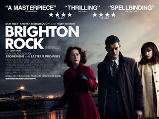
Brighton
Rock (2010, Directed by Rowan Joffe)
 In 1964, Pinkie Brown, a sociopathic member of a Brighton
gang, murders a man who has himself killed the gang leader, Kite. He befriends
Rose, a young waitress who had witnessed gang activity, so as to keep an eye on
her, and she falls in love with him. In order to prevent her from being made to
give evidence against him, he marries her. Ida, Rose's employer and a friend of
the man killed by Pinkie, takes it upon herself to save the girl from the
monster she has married.
Narrative - From looking at the male characters face it gives the idea it
is an action/thriller themed film, along with the use of clouds and sky, the
darkness and the light this reinforces the idea that this is a good vs. evil /
revenge and redemption styled movie circling around the male character. The
poster portrays the main protagonist very obviously with a traditional
representation of masculinity, this is shown through the centre positioning of
his character and his name being put first in the text of actors names characters
connoting that he is of higher importance and is at the centre of the
narrative. Also the low key lighting used on one side of his faces portrays him
as evil or showing the emotion of anger this is also shown through his facial
expression and body language as his is posed 'ready for action'.
Genre: The use of the
backgrounds colour could be suggesting an eventful storyline so it is most
likely an action thriller. This is reinforced by the facial expression of the
male and female on the right, along with the male’s body language which is
suggests that he is aggressive and possibly violent. The costume used helps the
audience suggest the genre and era of the film, for example the clothes worn
are 'very sixties' and the film is probably from that era, also the male
character has his collar up on his coat which may suggest crime in the
narrative, it's as if he has something to hide about his identity. The large
and bold white title displayed on a dark background also suggests that this
film could be a thriller including the narrative use of binary opposites shown
through the use of lighting for example the poster uses low key lighting vs
whereas the film narrative may use good vs bad. It is directed at an older audience
this is shown by the genre portrayed, the age certificate of 15.
Representation: The male character seems to be a
representation of a young middle class adult (suggested through his clothing).
His facial expression seems to suggest an aggressive possibly violent
disposition portraying a generalization that young males could be holding in
anger and rage which could threaten or harm others. The woman on the right
seems to be mirroring the male characters basic aura whereas the woman on the
left seems to be much more concerned about the male, suggesting she could be looking
out for his safety and well-being giving the impression that she is a much more
emotionally compatible character to the audience. This could be a
generalization of what people were expected to be like during the time this
film was set, the film is based pre-world war 2 so it could be a representation
of the animosity that lead up to the events that would take place. The
femininity and masculinity on the poster is very clear with the positioning of
the characters, the composition of the frame, and the costume, body language
and facial expressions of the characters. We’re told that the male character is
empowered, the older female character is traditionally represented in a pink
coat with a vulnerable expression, and the younger female is a more modern
representation, looking in control and fashionable.
Target Audience : I would say the target audience would range
from 15 and over. With Helen Mirren and John Hurt starring in it, I would think
the film would open up a much bigger target audience to the older generation.
This is due to both stars performing in other films and being respected actors
of the film industry with their own fan base. We can also assume that the
readers of the classic novel would be interested to see the adaptation as there
is already a fan base for the product with a more mature audience.
 Primer (2004, Directed by Shane Carruth)

Carla - this is really disappointing. What's going on? This research needs to have lots of time spent on it. You appear to have written very few notes and then left it. The second isn't even here?? Much of your blog (each of you) needs serious work to achieve even level 3. Currently, each of you will struggle to get above level 2 still on the blog. You can use existing headings to improve this, but you can't invent posts that haven't been made in the first place. What do you plan to do about this?
ReplyDeleteSorry I have done it, I just forgot to upload it, I did it on Word and then completely forgot sorry!!! I've uploaded the one I did at college and the other one is on my computer at home, so will upload that when I finish college.
ReplyDelete